
Work
Mr Food Details

Black #000000
Turquoise #009688
White #FFFFFF
Font used was Roboto
Main color decided as a blue green, to give values of knowledge, health and Tech.
Details
No longer must you think about what ingredients you need, or what recipe will suit your time table.
So come take a gander y'all
Hover For UI
Hover For UI

Problem
Personas interviewed showed a differentiating tech skill, but low to medium cooking skills.
Personas most relevant to the app are millennial's, urban, usually singles.
Further
As per requirement by users and popular conventions (reticle, icons, gradient nav's), Google material design was used to base the main gestures and menu
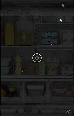
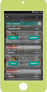
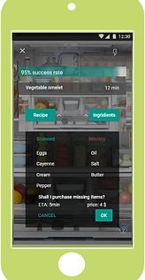
App is designed with a minimal initial interface. The app immediately jumps to camera mode (with on-boarding for first timers) thus solving on one hand- the less skilled user problem- quick and easy scan, instructions and results, while making the tech savvy user a paved road to results, (app also allows for ordering food, and user emphasized results).


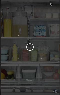
Utilizing as few screens as possible was a requirement to make things easier for the app user. However the Demo seen is just a small part of the app. It takes care of guidance, instruction, malfunctions etc.
